The cover art for a book is very important. It catches the eye of the potential buyer. It offers clues about what’s inside. It invites the reader in – or – it keeps the reader out.
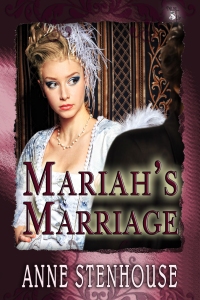
My truly lovely cover art for Mariah’s Marriage is by CK Volnek. We had a few exchanges back and forth and agreed on this. I like it because it encapsulates, in the girl’s expression, so much of her character as it unfolds through the text. It was only after I became a published novelist that I realised something I’d known subliminally for a long time. The cover art is an important part of the writer’s relationship with the book.
As a wannabee writer, I’d sat through countless talks where writers, particularly children’s writers, complained bitterly about the covers of their books. Children’s writers go into schools and are asked by children readers things like:
“Why does Timmy have red hair in the book and black hair on the cover? It spoiled it for me.”
As well it might.
My publishers, MuseItUp, have a very good cover art form and a principle question is what colour is the protagonist’s hair.
My first published story was called Stereotypes and it was illustrated. Magazines don’t, in my experience, consult about the illustration. This is unlikely to matter. They have their house style for illustration just as for the content, but in the case of Stereotypes, the artist used the stereotype and to my mind sent the wrong signals. The story was about a role reversal where the Prof turned out to be female and the cleaner male. Sadly, the story was illustrated by a man in a suit! It niggled at the time, although being my first sale, I was too starry eyed to make any kind of fuss.
Once the magazine is published of course, it doesn’t come again. With books, the writer may have an opportunity to change if rights revert. You might want to change in order to modernise if time has passed. Illustration, like anything else, alters over time. What is new and exciting today may be old and tired by the next time.
The photograph at the head of this post was taken in Melbourne of an exhibit in the Angels and Demons street sculpture exhibition. The figure is challenging, stark, mischievous. The angels, with wings not tails, were no less so and certainly not reassuring. What kind of story would they best illustrate? I’d go for a story about that teenage into young adult stage when one’s relatives encapsulate both the dark and the light almost in the same breath, the same sentence, the same heartbeat. What do you think?

My cover for Bella’s Betrothal, again by CK Volnek.
The girl has just that head of red corkscrew curls one sees in Scotland from time to time, the man is an outline – someone yet to be known, and the skyline sets it in Edinburgh with the forbidding lines of the castle behind. I love it. It truly enhances my relationship with the book.
http://goo.gl/pASdjp Mariah’s Marriage US
http://goo.gl/NxYxj5 Mariah’s Marriage UK
http://goo.gl/PKptQg Bella’s Betrothal US
http://goo.gl/5RBzIm Bella’s Betrothal UK


You are right Anne to say that covers are of vital importance. They truly must entice the reader to buy the book. Every detail, from the font and colour of the graphics, to the photo of the characters or the setting,must not only be true to the story but also capture the mood of the novel. Your two covers are really beautiful. I haven’t yet read Marriah’s Marriage but Bella is just perfect! Charlotte Volnek is a great cover artist. She listens to you and takes all your comments into account. She did my cover for The Lion’s Embrace’ and didn’t mind changing colours, details and the lettering. I am glad she won an award in the P&E Poll!
LikeLike
Hi Marie, I hadn’t picked up that Charlie had won an award. That’s great news. Thanks for sharing. Anne
LikeLike
Interesting post, Anne, and I do agree about the importance of the cover. I think Charlie must be one of the most gifted cover artists around.
LikeLike
Hi Ros, yes, I feel I’ve been lucky, Anne
LikeLike
Interesting post, Anne. I’ve never thought about how the cover art can influence the writer’s relationship with a book. Now I have read your thoughts about it, I can see how it does. And as a reader I love your covers.
LikeLike
Hi Mary, thanks for dropping by. Glad you see the point and thanks for the compliment – I hope Charlie sees the nice things people have said about them. Anne
LikeLike
CK did my cover for The Great Fruitcake Bake-off and she nailed it right off. I like yours a lot.
LikeLike
Hi Vicki, Thank you. I’ll take a look at yours in the MuseitUp store. Aren’t we lucky? Anne
LikeLike
I love the way the eyes in your two covers set you thinking about what the book might be like. In the first, the eyes are looking into the book rather than at the reader making you wonder what she is seeing whilst the second has an out and out challenge suggesting a more feisty character.
As for the Devil Baby sculpture, the stance suggests more animal than human to me so maybe a story set between two worlds.
LikeLike
Hullo Ann, nice to see you here again. I do see the same kind of differences between the ladies.
I found the sculptures quite scary in some moods. They were numerous and large. Anne
LikeLike
Hi Anne. I enjoyed your post and I think your covers are lovely. They really do encapsulate the mood of the books.
I thought what you sad about the cover enhancing the relationship of the author to the book was very interesting and I do agree. I’ve found that to be true in my case too.
Christine
LikeLike
Hullo Christine, Yes, this thread does seem to have struck a chord with people. I remember a speaker at EWC, who was in bookselling, telling us that the lady with long blonde hair and a horse was what sold the book. Anne
LikeLike